-
Analyzing Colgate Ads

Airliftz is a young malaysian singer that was chosen for Colgate’s campaign
Chief Creative Officer: Adrian Miller

ORIGINAL AD ANALYSIS
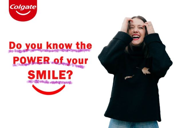
Amazing the story that this ad has behind, I felt completely sure that this was the ad I was going to use when I read the phrase “SMILE STRONG”. Colgate launched a brand film for Colgate’s Smile Strong campaign that highlights the power of smile in the face of adversity.
Design
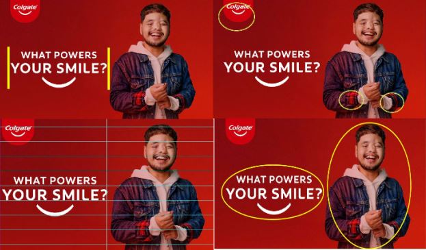
Is easy to know the designer was an experienced one, this is a very good job when talking about proximity, contrast, repetition and alignment.
I see the contrast is great, is very clear and easy to read and identify the items even when you see red over red. It is well-aligned, and clear to know that the words are the same paragraph even when it has diferent size.
Color
I can tell the designer chose to use the brand’s colors, it is a good choice in this case to make sure people can identify it at first sight, it is vibrant and tones matched very well.
Typography
Designer used Sans-serif in this ad and all caps, just clear and simple but with very high contrast to catch the attention.
NEW AD ANALYSIS
Design

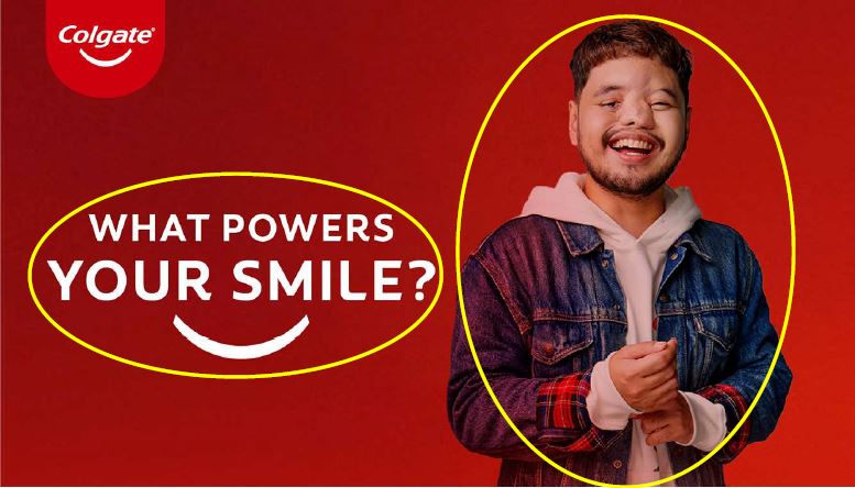
This fit the campaing because it meets the design rules such as contrast between the words and image, the alignment specially between the lines in the sentence, the proximity of the words, picture and the logo makes it clear what is the center of the ad, and the repetition, colors are used more than once which makes repetition in the design.
Color
The color used in the new ad are the same used in the original but colors are inverted to cause more contrast between the background and the logo.
Typography
I used Franklin Gothic Demi, similar to the one used by the designer that did the previous ad, also Sans-Serif, but using caps on specific words to make emphasis.
Conclusion
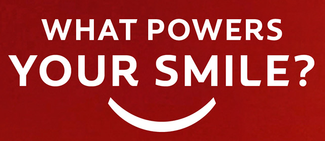
Both ads work together very well because they both are looking to make sure people reflect on the importance of the smile and also highlight Colgate in the ad by using their colors.
The design is simple but attractive, same for both designs.
By: Yara De Jesus
-
Was it a designer or a toddler?
This magazine spread layout was found in a portfolio by Jen Wallace, he/she has several magazine designs, I chose to critique this one because it looks interesting to me the way the topics we learned in this week’s assignments where implemented.

With nothing to add, let’s start the critique…
-
Fresh juice, fresh thoughts…

By: Haidarah Photography
https://www.instagram.com/p/B9wepbsH8xW/Haidarah Photography has this image in the business Instagram as part of the collection already created, this is not the only brand, they have plenty of them. I chose this image to complete my reverse engineer process due to the high quality this ad posses. I feel like Haidarah did a great job according to the points I’m going to explain on this post.
COLOR

Some times it can be overwhelming to choos the right color , but I’ll like to start highlight the great job the designer did choosing the right colors. It looks like he took advantage of the analogous combinations.
Alignment

The designer used the most common alignment, centered alignment. making it look definitely a conscious choice this time.
Proximity

This visual unit created makes it easy to understand that the main information here is that the juice is FRESH, without thinking that we talking about something else when it says “100% pure juice” & “REFRESH YOUR LIFESTYLE”.
Contrast

It looks like the designer knows contrast is crucial to organization, imagine this letters in orange color, it was going to be difficulto understand or possibly wouldn’t even caught anyone’s attention, but instead the letters color is white, which makes it easy to read and also made some items smaller than the bottle of juice, which makes us understand the purpose.
Repetition

Two repetitive elements here are the oranges and leaves, this adds the visual interest needed for any ad, it is repetitive but not overwhelming.
CONCLUSION
Overall the basic design principles have been used very well on this design, it is clear, organized, well colored and meets the goal of each principle.
-
Subscribe
Subscribed
Already have a WordPress.com account? Log in now.
