Airliftz is a young malaysian singer that was chosen for Colgate’s campaign
Chief Creative Officer: Adrian Miller

ORIGINAL AD ANALYSIS
Amazing the story that this ad has behind, I felt completely sure that this was the ad I was going to use when I read the phrase “SMILE STRONG”. Colgate launched a brand film for Colgate’s Smile Strong campaign that highlights the power of smile in the face of adversity.
Design
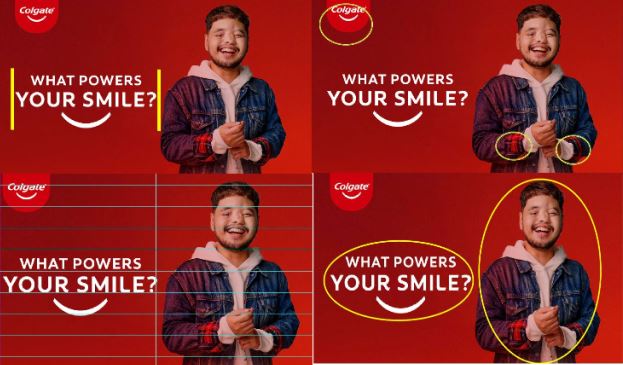
Is easy to know the designer was an experienced one, this is a very good job when talking about proximity, contrast, repetition and alignment.
I see the contrast is great, is very clear and easy to read and identify the items even when you see red over red. It is well-aligned, and clear to know that the words are the same paragraph even when it has diferent size.
Color

I can tell the designer chose to use the brand’s colors, it is a good choice in this case to make sure people can identify it at first sight, it is vibrant and tones matched very well.
Typography
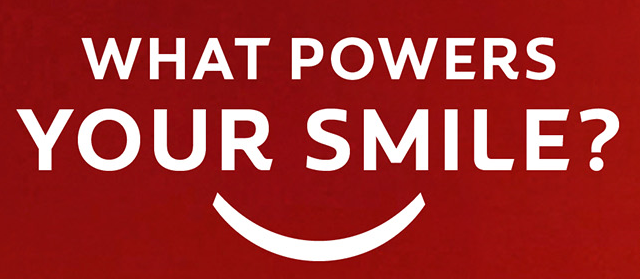
Designer used Sans-serif in this ad and all caps, just clear and simple but with very high contrast to catch the attention.
NEW AD ANALYSIS
Design
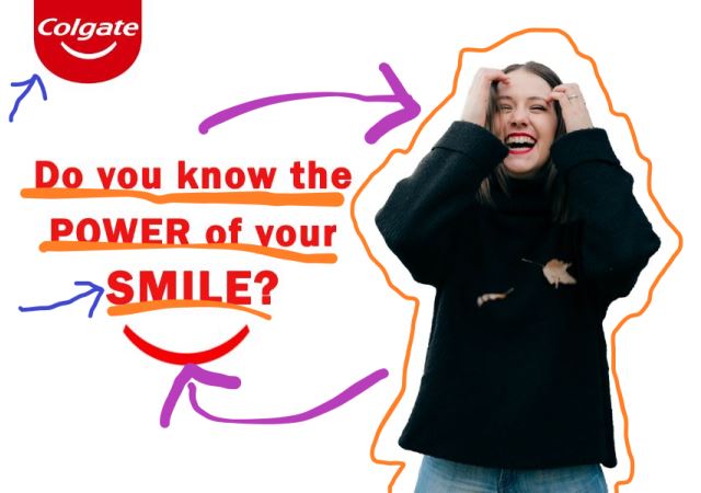
This fit the campaing because it meets the design rules such as contrast between the words and image, the alignment specially between the lines in the sentence, the proximity of the words, picture and the logo makes it clear what is the center of the ad, and the repetition, colors are used more than once which makes repetition in the design.
Color
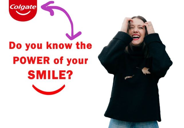
The color used in the new ad are the same used in the original but colors are inverted to cause more contrast between the background and the logo.
Typography

I used Franklin Gothic Demi, similar to the one used by the designer that did the previous ad, also Sans-Serif, but using caps on specific words to make emphasis.
Conclusion
Both ads work together very well because they both are looking to make sure people reflect on the importance of the smile and also highlight Colgate in the ad by using their colors.
The design is simple but attractive, same for both designs.
By: Yara De Jesus
